Power BI: Metrics
I evaluated the ease of use and learnability of key features introduced in Power BI. In this project, I conducted usability testing for Power BI's two new features: Link Metrics and Move Metrics.
Overview
Client
Microsoft Power BI
Timeline
8 Weeks
Responsibilities
Usability Testing
Skills
Usability Testing
Heuristic Testing
User Interviews
Research Coding
The Challenge
Microsoft Power BI is a business analytics tool that’s designed to help businesses with data visualization and goal tracking.
Their “Metrics” feature allows businesses to track goals and KPIs across teams.
Results
Through usability, I identified and presented 11 issues to Power BIs design team with 7 recommendations. Today, 6 of those issues have been addressed by the team.
53
Average SUS Score
11
Issues Identified
7
Recommendations
Background
Fig - "Drag and Drop" Moving a sub-metric from one metric to another
Fig - Linking a metric from one scorecard to another
Defining the Scope of Features
2 Simple Features: Move and Link Metrics
I focused on two new features that were introduced in Metrics:
Move Metrics - A “Drag and Drop” feature that allows for quick movement of metrics.
Link Metrics - “Linking” metrics allows certain metrics to be connected to different scorecards.
Understanding the Approach
Testing the Metrics through 3 Tasks
We conducted usability tests with 9 participants with users completing 3 tasks. After completing each task, participants were asked to answer a set of ease of completion questions.
These tasks were -
Move a metric
Duplicate/Copy a metric to another scorecard
Identify and Delete a Linked Metric based on score attributes
After completing the 3 tasks, participants were invited to complete a set of Likert questions that helped us arrive at a SUS score for each participant.
Findings
Finding No. 1
Discovery: Participants can "drag-and-drop" a Metric but not multiple/filtered Metrics.
Recommendation: Standardize the “drag-and-drop” experience across multiple metrics and filters.
A show of how a participant tries to drag and drop multiple metrics at a time and is unable to do so.
Finding No. 2
Discovery: 4 out of 8 participants lost track of metrics when moving them between metric groups.
Recommendation: Provide a more visually prominent form of feedback when moving a metric.
Participant drags and drops a metric and suddenly can't find it due to the lack of feedback and system update.
Finding No. 3
Discovery: All participants struggled to distinguish a linked metric from an unlinked metric.
Recommendation: Make Linked Metrics more visible and easier to identify.
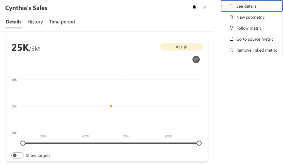
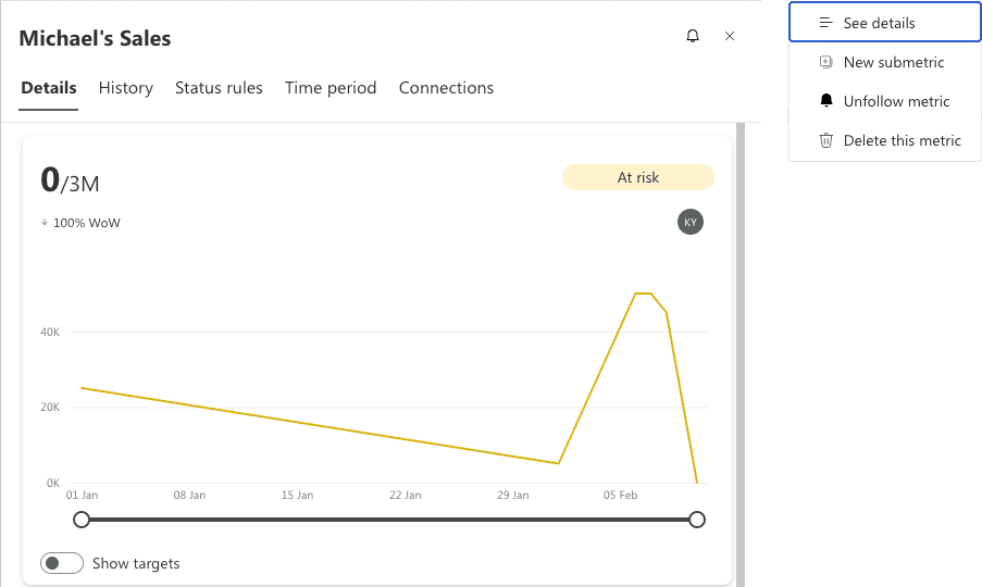
Fig - On the left, we see a linked metric along with its dropdown section that mentions "Go to source metric" and "Remove linked metric". These buttons are the only way one can identify and distinguish a linked metric from an unliked one. On the right, we see a normal unlinked metric with its dropdown button section.
Finding No. 4
Discovery: Participants deleted linked metrics by memorizing them.
Recommendation: Simplify the process for identifying a linked metrics and its source hierarchy
The journey shows the participant memorizing the names of metrics from the scorecard "Struggling Salespeople" and moving to the other scorecard "Sales Report - Praxis Technologies" to identify a linked metric that needs to be deleted.
Finding No. 5
Discovery: 3 different drop downs with 3 different levels of functionality increased confusion and doubt amongst participants.
Participant navigating through the 3 different dropdowns to identify their roles and functionalities.
Finding No. 6
Discovery: Cognitive load faced by the user increases as more metrics are added to a scorecard.
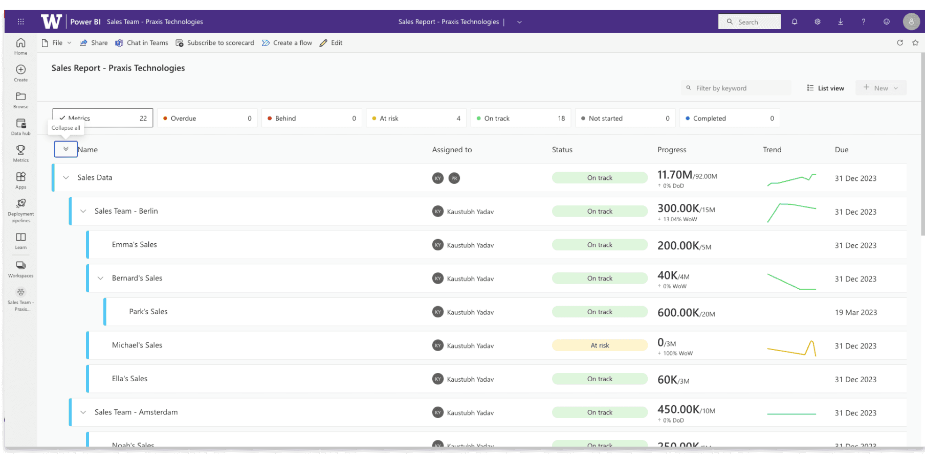
Screenshot of the scorecard that was used for the study. This scorecard has a number of different metrics with no easy way to distinguish elements.
Finding No. 7
Discovery: Interface elements lacked clear context of use.
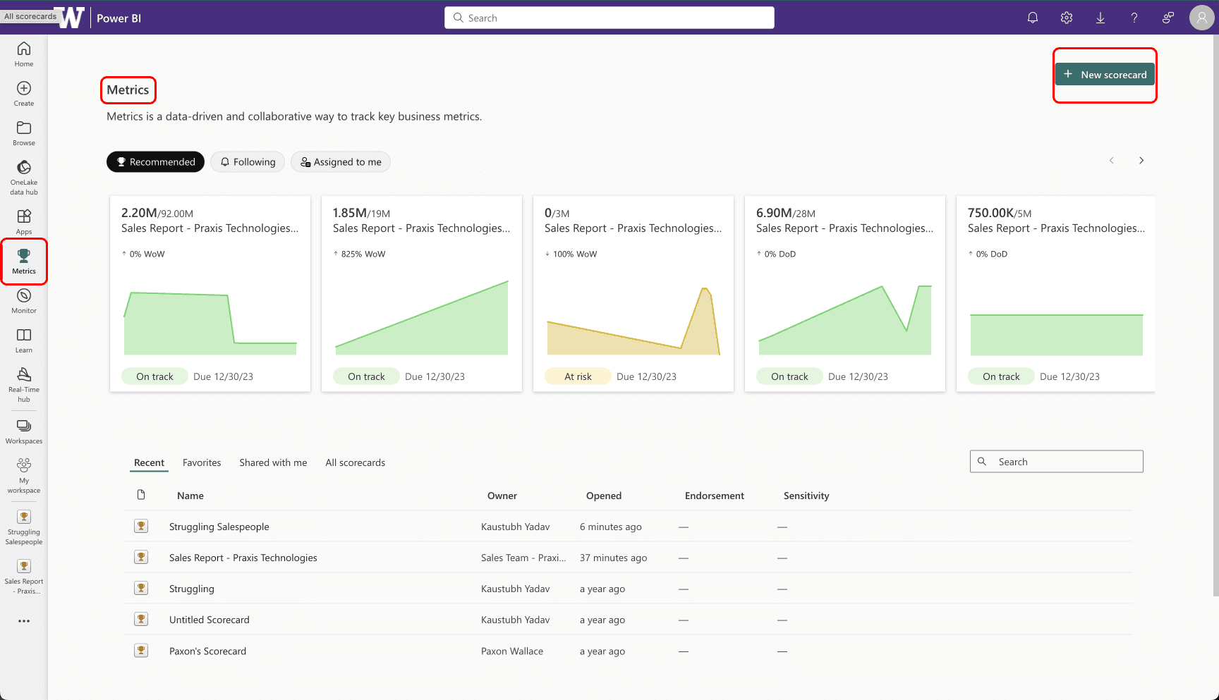
Screenshot of the Metrics page. While being in a metrics section, the primary button asks people to create a "New Scorecard".
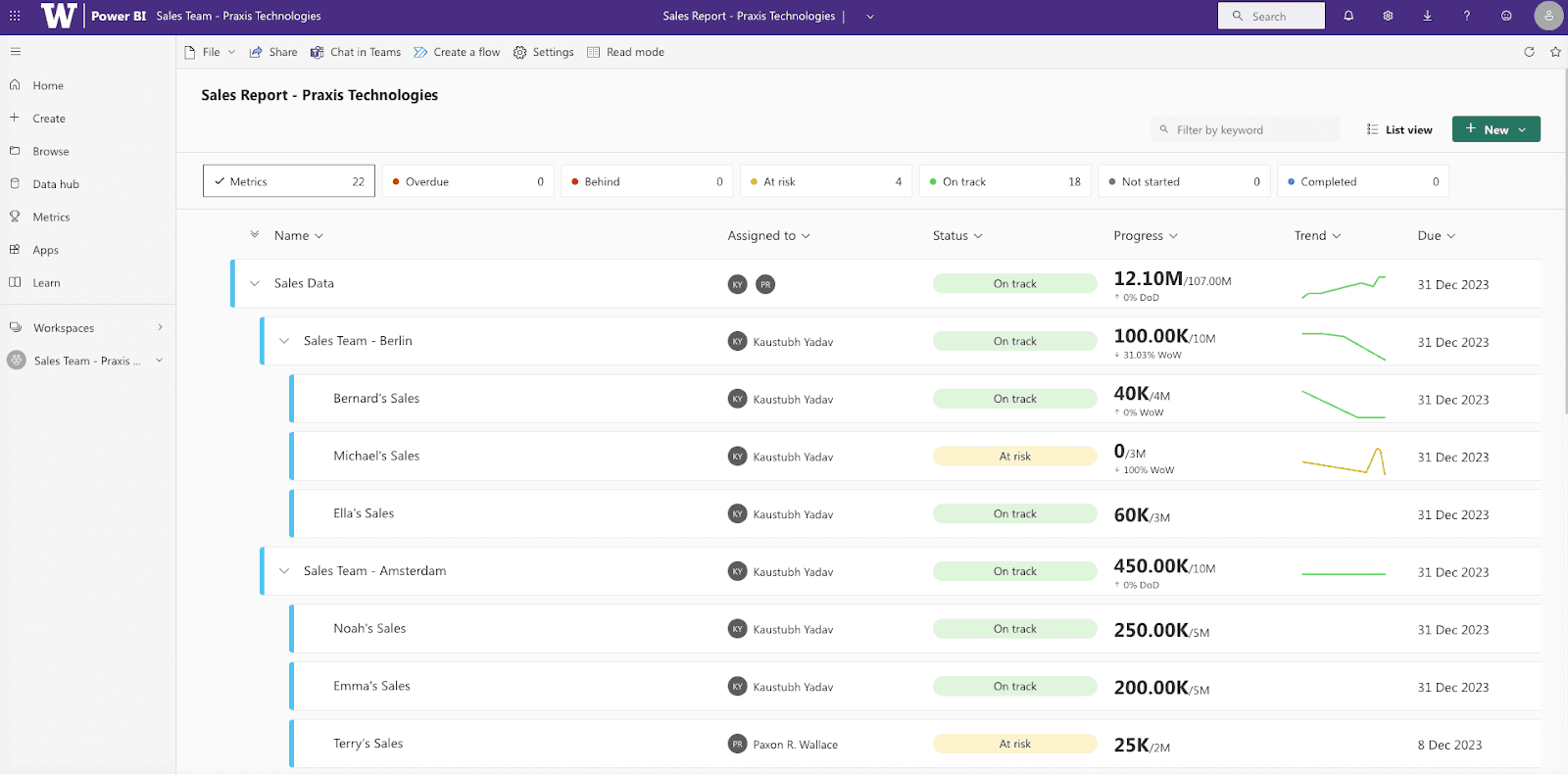
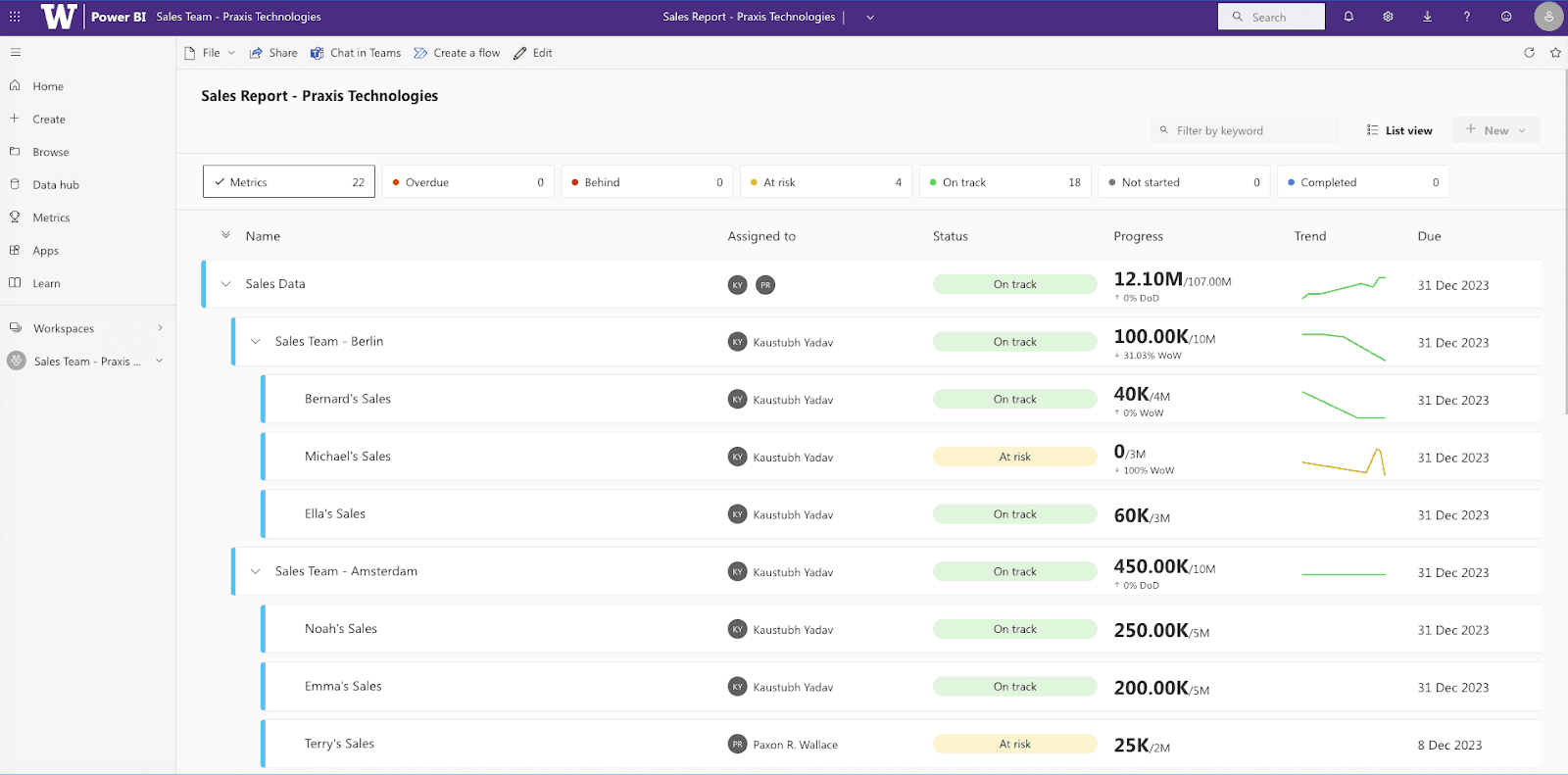
Side by side comparison of "Read" and "Edit" modes. Users struggled to understand which state they were in and what type of interactions were possible in that mode.
Results
SUS Score - 53
Based on the 3 tasks, we arrived at the following Ease of Completion scores for the 3 tasks -
Move a metric - 3.6
Duplicate/Copy a metric to another scorecard - 3.0
Identify and Delete a Linked Metric - 3.5
SUS Score - 53
Next Case


